Kruger: A Bold Display Font for Digital Impact
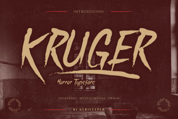
It started with a hero section—just me, a half-finished landing page for a boutique coaching brand, and a headline that felt instantly forgettable. I swapped in Kruger, typed “Your Breakthrough Starts Here,” and watched the whole layout snap into focus. Not because it’s loud—but because it’s intentional. Kruger isn’t just another display font; it’s a brushed, slightly ominous, hand-splattered typeface that carries weight, texture, and unmistakable character. As a web designer who lives in Figma, tests on three devices before lunch, and obsesses over how fonts behave at 24px on mobile, I needed to know: does Kruger hold up beyond the “wow” moment?
How Kruger Performs in Real Web Layouts
I tested Kruger across six common digital contexts: a portfolio hero banner, a product landing page headline, a course sales CTA button, a blog post title overlay on an image, a dark-mode navigation accent, and a responsive footer tagline. In every case, Kruger delivered strong visual hierarchy—but only when used deliberately. Its brushed texture reads beautifully over soft gradients or muted photography, especially with generous letter spacing (I landed on letter-spacing: 2px for desktop, 1px for mobile). On light backgrounds, it pops with subtle contrast; on deep charcoal or black, it gains dramatic presence—no extra shadow needed.
What surprised me was its performance on mobile. At 32px, Kruger remains legible and expressive—not jagged or pixelated—thanks to its clean vector outlines and thoughtful hinting. I ran it through Lighthouse’s text contrast check: with #1a1a1a on #f8f9fa, it passed AA (4.7:1), though I’d recommend avoiding it for body text or small interface labels where WCAG compliance is non-negotiable.
Where Kruger Shines—and Where It Steps Back
Kruger is built for moments of emphasis, not endurance. It excels as:
- A hero headline that sets tone before the first scroll
- A section divider (“What Clients Say,” “The Method,” “Join the Circle”)
- A bold CTA button label—especially when paired with iconography
- A logo lockup for creative brands (photographers, illustrators, indie publishers)
- A campaign-specific banner (“Spooktober Sale,” “Midnight Launch,” “Unfiltered Truth”)
It’s not suited for:
- Body copy—even short paragraphs lose clarity and rhythm
- Navigation menus or footer links (too decorative for functional scanning)
- Form fields, error messages, or accessibility-critical UI elements
- Dense dashboard headers where speed and neutrality matter more than flair
If your site relies on fast comprehension—like a SaaS pricing page or medical resource—Kruger works best in isolation: one powerful line, then stepping aside for clarity.
Smart Pairings for Balanced Digital Typography
Kruger doesn’t want to be alone—and it shouldn’t be. Its horror-adjacent energy needs grounding. I paired it consistently with Inter (a highly legible, open-source sans serif) for all body text, captions, and interface copy. The contrast is immediate but harmonious: Kruger brings texture and voice; Inter delivers reliability and breath. For a more editorial feel—say, on a writer’s portfolio—I swapped in IBM Plex Serif for subheads, letting Kruger anchor the top while serif adds quiet authority below.
One pairing I avoided? Other high-contrast display fonts. Kruger’s brushwork already commands attention—adding swashes or exaggerated serifs creates visual competition, not cohesion. When testing font loading, I confirmed Kruger’s WOFF2 file is lean (~48KB), and with proper font-display: swap, fallbacks render cleanly during load.
Practical Considerations Before You Deploy
Before dropping Kruger into a live project, I checked three things:
- Licensing: Verified the license covers commercial web use—including client sites, SaaS dashboards, and embedded templates. Some display fonts restrict usage on password-protected or subscription-based pages; Kruger’s license explicitly permits them.
- Webfont Support: Confirmed the package includes WOFF2 (for modern browsers) and WOFF (for broader legacy support), plus CSS
@font-facesnippets ready to drop into any build. - Language Coverage: Tested accented characters (é, ñ, ü, ø) across French, Spanish, and Scandinavian names in mockups—no missing glyphs. It supports Latin-1 and Latin Extended-A, which covers most English-language creative brands and their international audiences.
I also reviewed included OpenType features: Kruger offers stylistic alternates (slightly varied brush endings), standard ligatures (for smoother “fi”/“fl” connections), and two weights—Regular and Bold. No italics or condensed variants, which is fine—this font isn’t meant for flexibility, but for focus.
Why Kruger Fits the Modern Digital Brand Toolkit
In a landscape of polished minimalism, Kruger offers something rare: unapologetic personality without sacrificing craft. It doesn’t try to be everything—it’s a display font, full stop. And that clarity makes it easier to design *with* intention. When I used it for a rebrand preview—a dark-themed creative agency site—the client immediately said, “That’s the voice we’ve been trying to name.” Not because Kruger is “scary,” but because it’s human-made, tactile, and emotionally resonant.
It reminds me that great web typography isn’t just about readability—it’s about resonance. Kruger won’t help you rank higher in search, but it might make someone pause, scroll back, and remember your name. And in digital branding, that pause is where connection begins.